Toronto Life Magazine
Toronto Life is the city’s preeminent publication for food, real estate and cultural news. In the lead-up to its 50th anniversary, the publisher initiated a redesign of the website to help it connect with its printed magazine as a brand and establish itself as a modern digital publication.
I teamed with the digital product manager and print art director to plan, strategize and redesign the website. Collaborating with stakeholders in advertising, art, technology, and editorial, my focus was to bring the quality of the magazine to the overall experience online.
While working as creative director at SJM, my team and I also implemented constant improvements to torontolife.com and launched special projects like Neighbourhood Rankings and Best Restaurants.

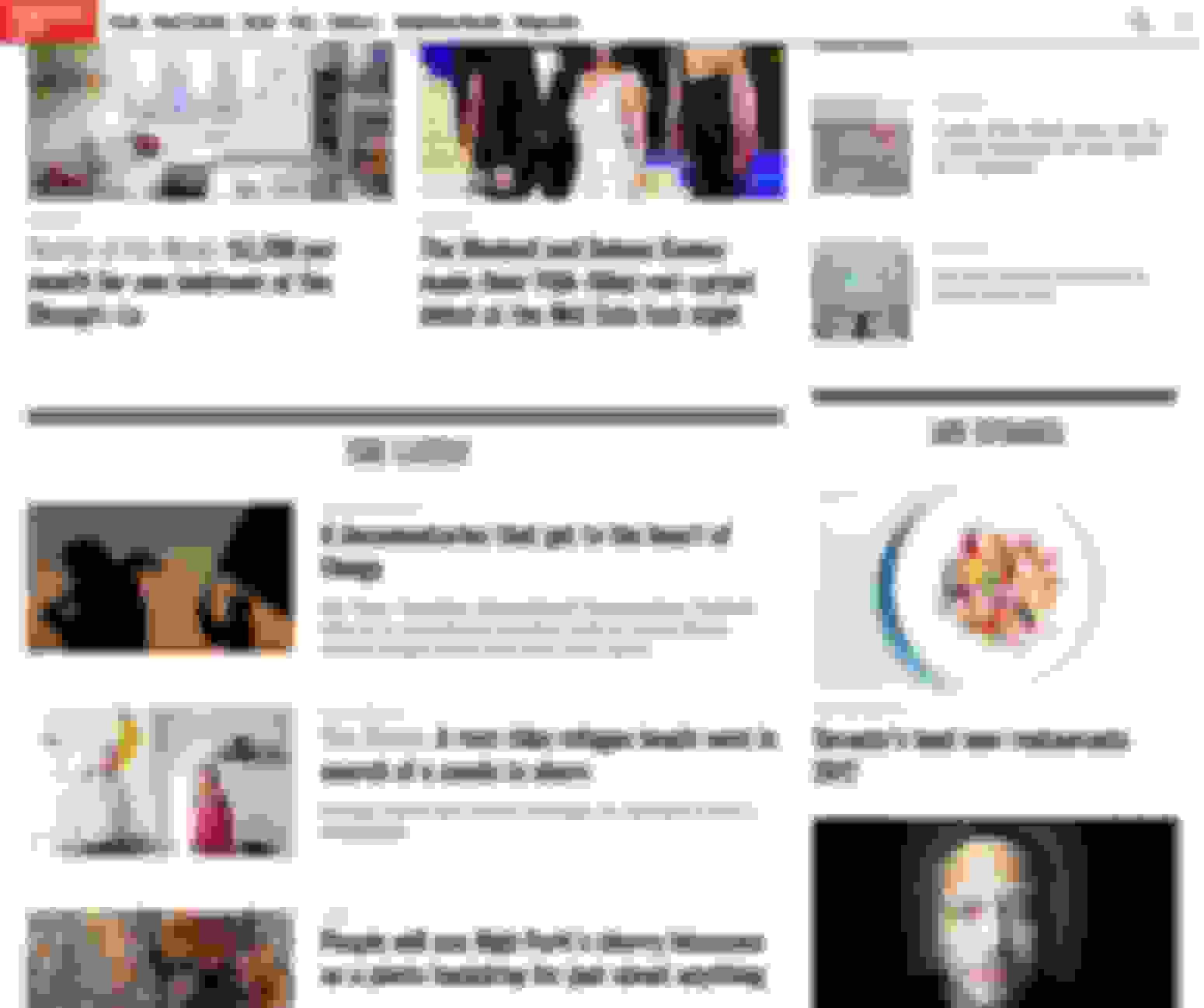
Homepage
Our goal was to design an experience that is easy to read and navigate, “future-proofed,” to help advertisers better reach Toronto Life’s audience and apply a refined implementation of the typography and colour while keeping in lockstep with the print edition.
As opposed to designing the site 'mobile first,' we adopted an 'everything at once' approach, keeping the visual style, content hierarchy and editorial priorities front and centre throughout the process.



Homepage Mobile
Article Page
Article Page
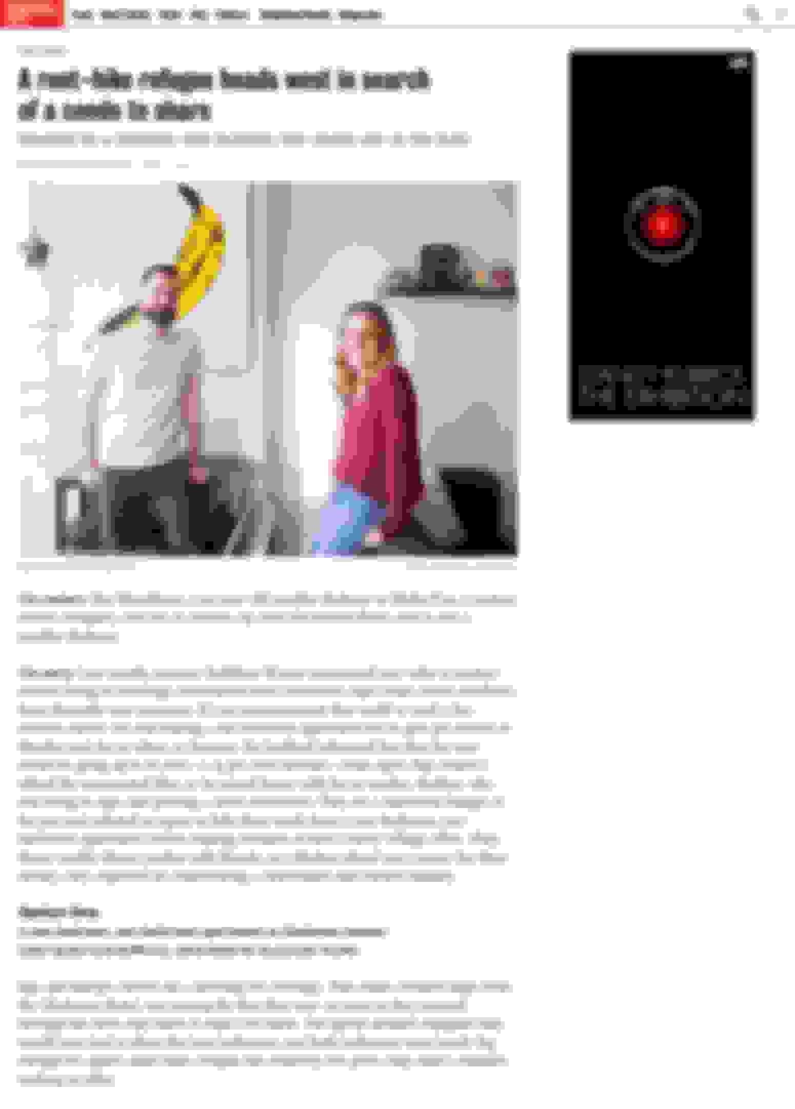
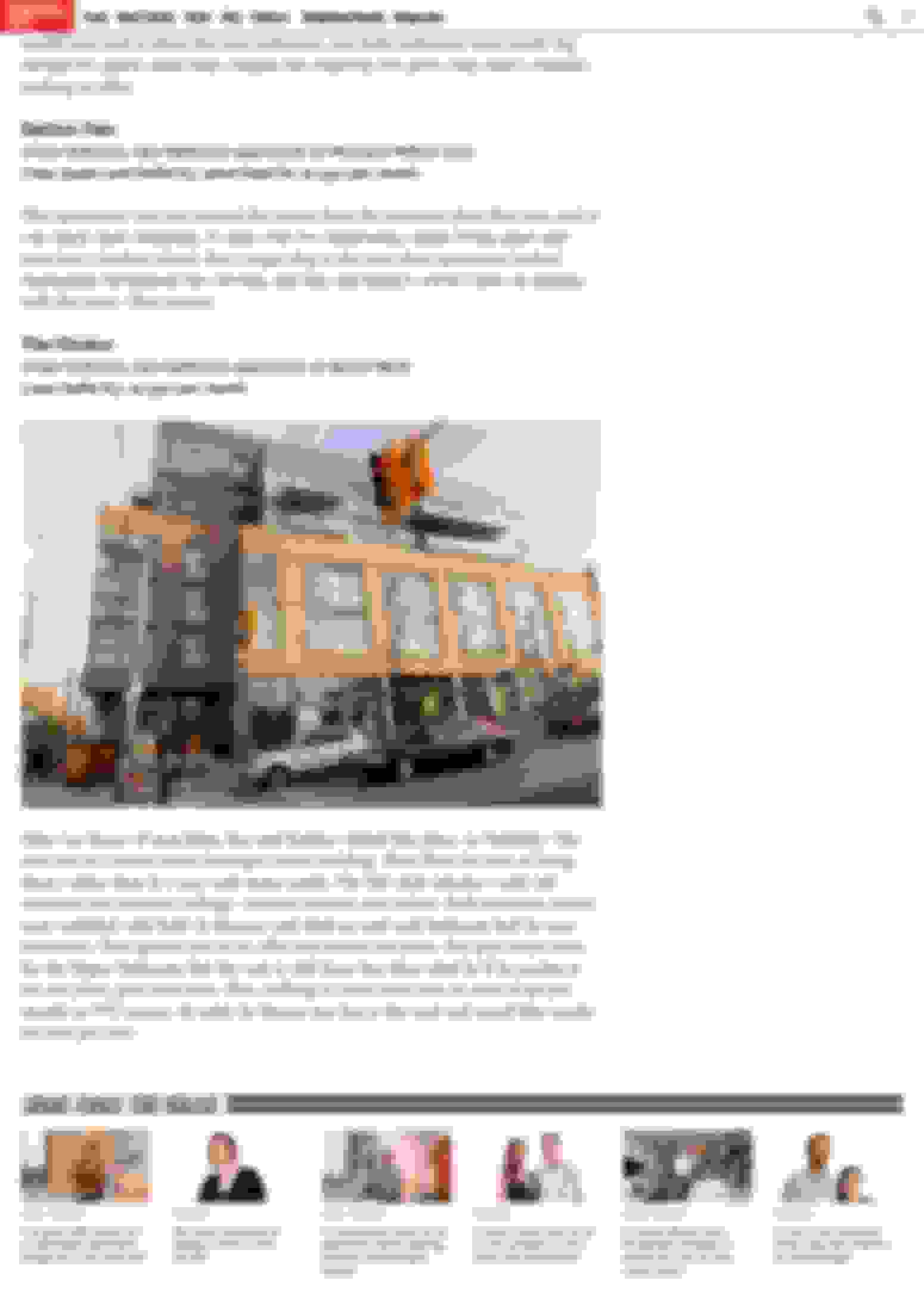
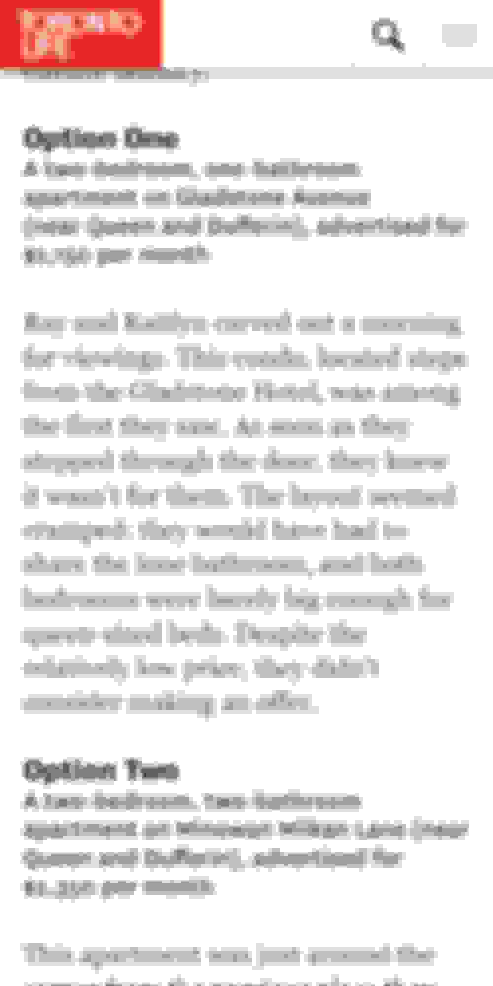
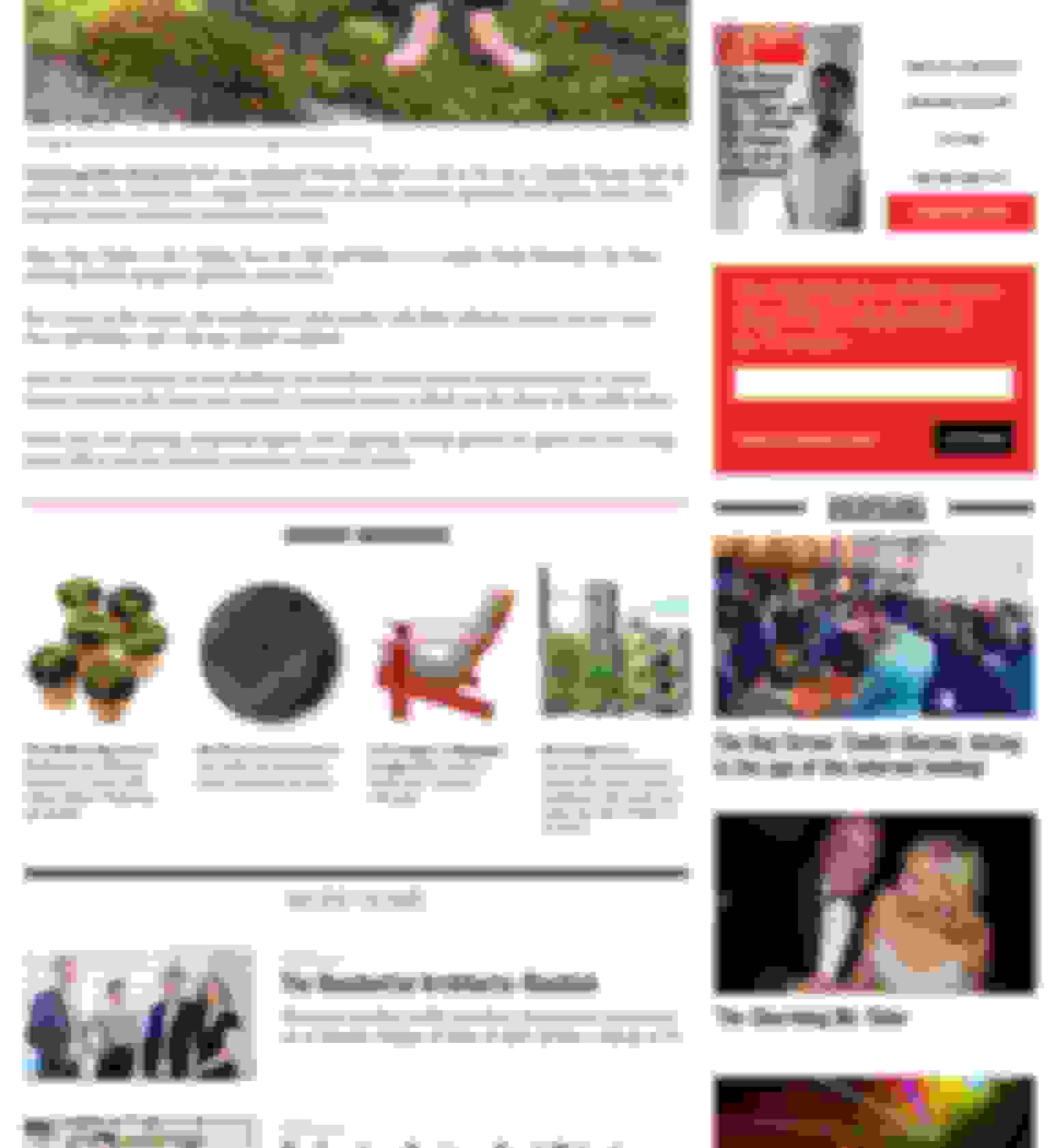
On article pages, we gave a big boost to the type size and leading, incorporated ledes, and distinct visual styles to call out Q&A's and other typographical furniture for a story.


Article Page Mobile
It was important to accommodate the way users consume content today. We built a responsive, modular system to give the editorial team a full suite of tools to tell stories and structure information on the site.
Navigation & Mini Header
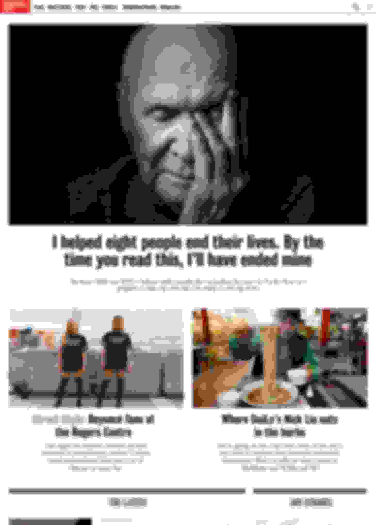
Modular Homepage

Hero Modules

Hero Modules
Once deployed, these modules afforded us a great amount of flexibility with presentation on the site; what would usually be five or six very static templates that editors shovelled content into became a flexible design system that could be deployed for most editorial purposes, from the examples here to the award-winning best restaurants article.
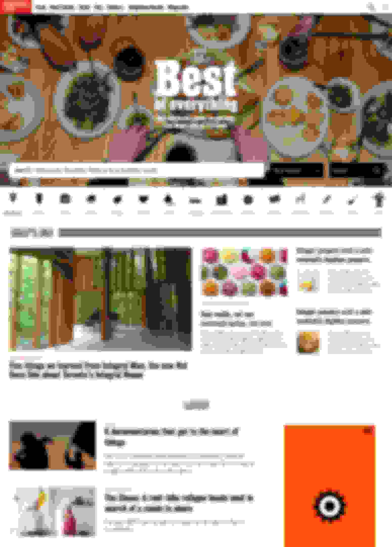
Best

Best
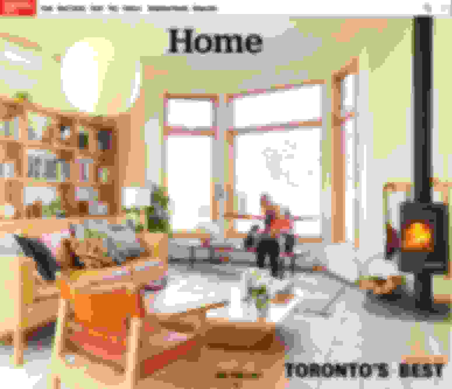
Sub Section Door
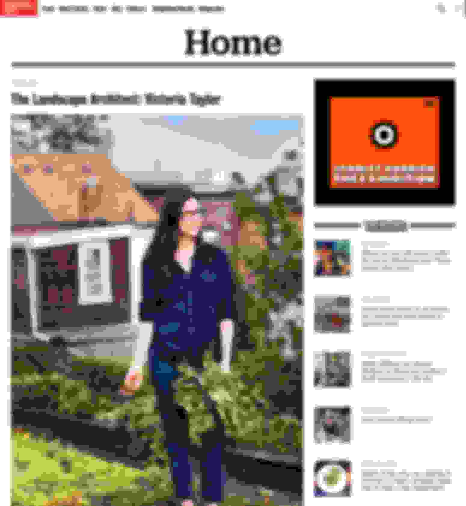
Sub Section Article
Sub Section Article
