Passport 2017
is an app designed to inspire Canadians and visitors to Canada to engage with cultural touchstones during our sesquicentennial.

Passport brand
In the lead up to Canada’s 150th anniversary of Confederation, the Department of Canadian Heritage sought to inspire Canadians and visitors to Canada to engage with cultural touchstones during our sesquicentennial. With thousands of events planned across the country, in addition to historical celebrations and cultural landmarks, Heritage Canada had no single means to promote them.


Onboarding
I led the brand and product design teams in conceptualizing Passport Twenty-Seventeen as an event discovery app and website that informed users about official events, celebrations, landmarks and articles matched to their interests.
During a quick onboarding process, the app collected user interests and stored them against a persona. It tracked interactions for rewards and allowed users to keep a list of favourite articles and events.


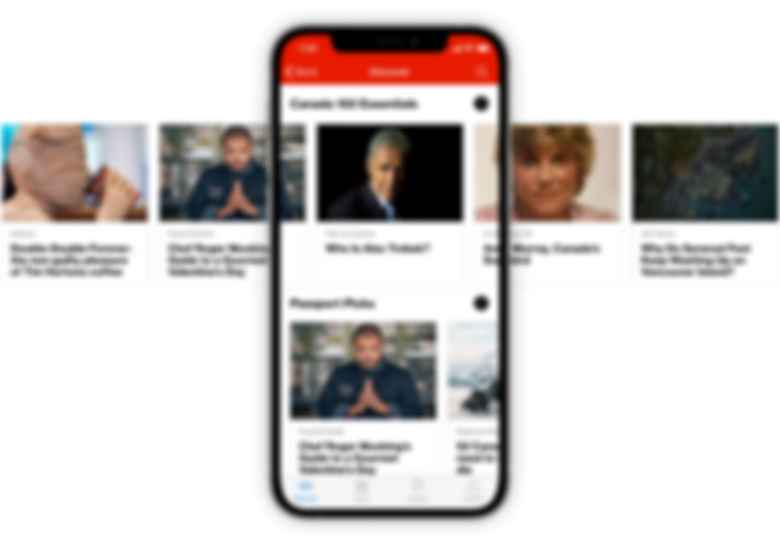
Discover page
Once inside, users can interact with stories and events matched to their selected interests. The app also presented editorially curated articles, cultural landmarks, events, and official sesquicentennial celebrations.
Discover Section


Explore Section


Map View


Filter

Typography
Neue Haas Grotesk serves as the default typeface for headers and data with Publico Text for body copy.
Key considerations in selecting these fonts were general readability on screen and similar x-heights for visual continuity.

Typography

Color
We wanted our brand to invoke Canadian modernist graphic design from the 1970s while keeping an obvious tie to the event discovery function the app performs.
Our first passes at the brand were to create a logo that was at once a 'p' for passport, a map pin, and the Maple Leaf and triband.
To steer away from the cliché-ridden world of event app branding (there was more than one we uncovered that used a similar mark), we moved away from the map pin to a more explicit ‘p.’ The final squared mark designed by Scott Rankin is where we arrived.
Brand

Brand
To facilitate the 'passport stamp' engine facet of the app, we engaged Doublenaut to conceptualize and draw the stamps for the categories we identified for the reward system in the app.

Badges